Navigation (16)
Welcome to our navigation category. Here, you'll find a comprehensive collection of stylish and functional navigation components designed to enhance user experience and streamline navigation on your website. Each component is meticulously crafted to be responsive, customizable, and easy to integrate into any project, ensuring you have the tools you need to create an engaging online presence.
Our navigation components offer a seamless blend of form and function. Designed with modern web standards in mind, these components not only look great but also perform exceptionally well across all devices. Whether you're building a personal blog, a corporate website, or an e-commerce platform, our navigation solutions will help you deliver a polished and professional user experience.
Features
- Responsive Design: Our navigation components are fully responsive, adapting gracefully to different screen sizes. This ensures a smooth and consistent user experience on desktops, tablets, and mobile devices.
- Customization Options: Tailor the appearance and behavior of your navigation components to match your site's aesthetic. Change colors, fonts, and layouts effortlessly using our well-documented customization settings.
- Interactive Elements: Enhance user interaction with features like dropdown menus, search bars, and toggle buttons. These interactive elements are designed to provide a richer and more intuitive navigation experience.
- Accessibility: Accessibility is a top priority in our navigation designs. Each component is built to be easily navigable by all users, including those with disabilities, ensuring compliance with web accessibility standards.
How to Use
- Integrating our navigation components into your project is straightforward. Simply follow the provided documentation, which includes step-by-step instructions, code snippets, and customization tips. Whether you're a seasoned developer or just starting out, you'll find the process intuitive and hassle-free.
-
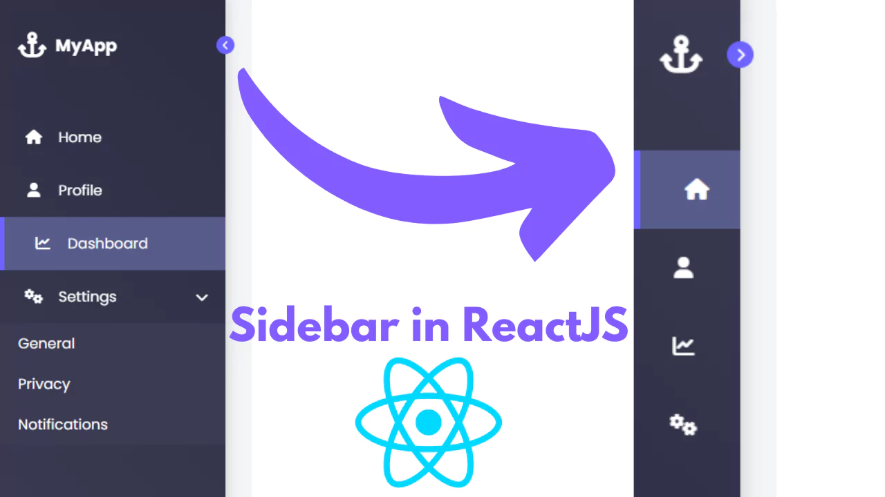
Create a Sidebar Using ReactJS
Learn how to create a sidebar in ReactJS with this detailed guide. Includes setup and step-by-step instructions.
-
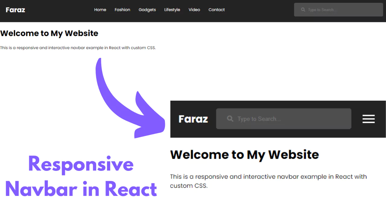
Learn How to Build a Responsive Navbar in React | Easy Tutorial
Learn how to build a responsive navbar in React with our easy-to-follow tutorial. Perfect for beginners looking to enhance their web design skills.
-
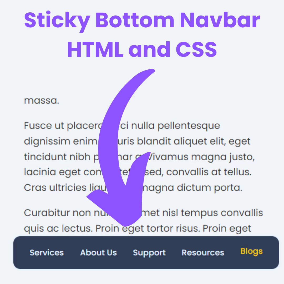
Create Sticky Bottom Navbar using HTML and CSS
Learn how to create a sticky bottom navbar using HTML and CSS with this easy-to-follow guide.
-
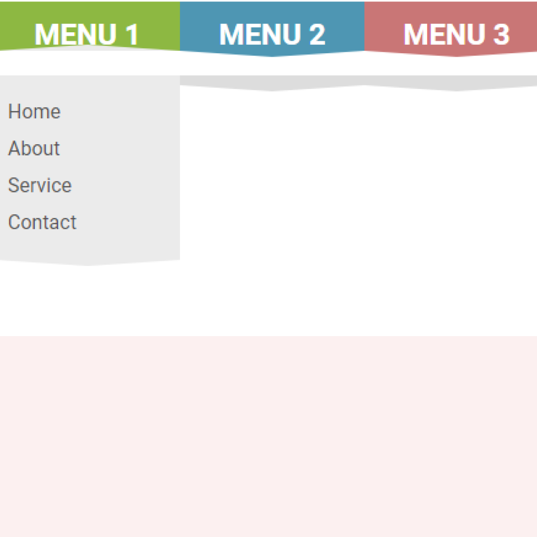
Drop-Down Menu Using HTML and Pure CSS
Learn to create a simple and responsive Drop-Down Menu using HTML and Pure CSS. Step by step guide with clear code snippets and explanations.
-
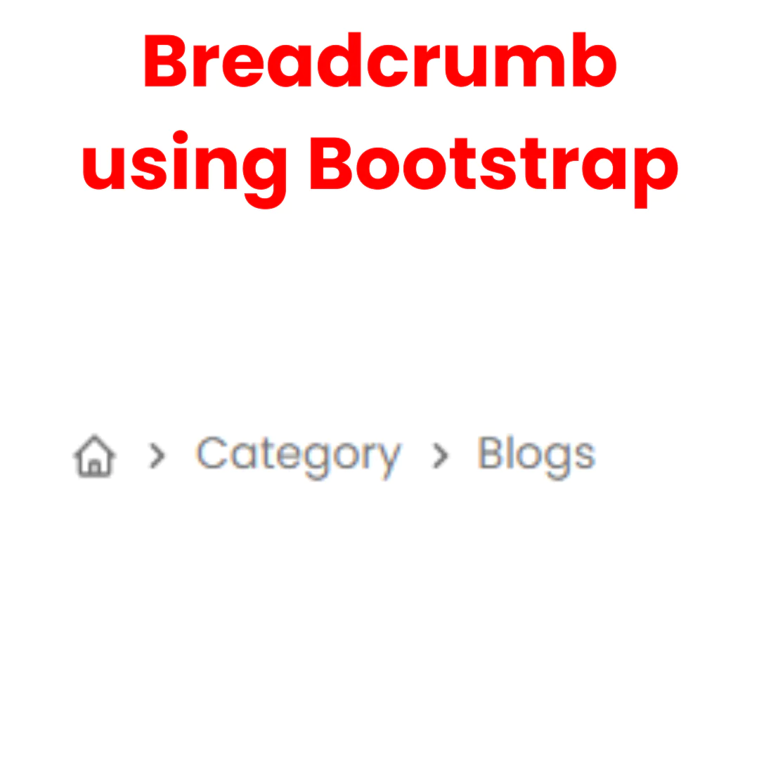
Create Bootstrap Breadcrumb Navigation | Tutorial
Learn how to create breadcrumb navigation using HTML and Bootstrap in this step-by-step tutorial. Perfect for beginners and web developers.
-
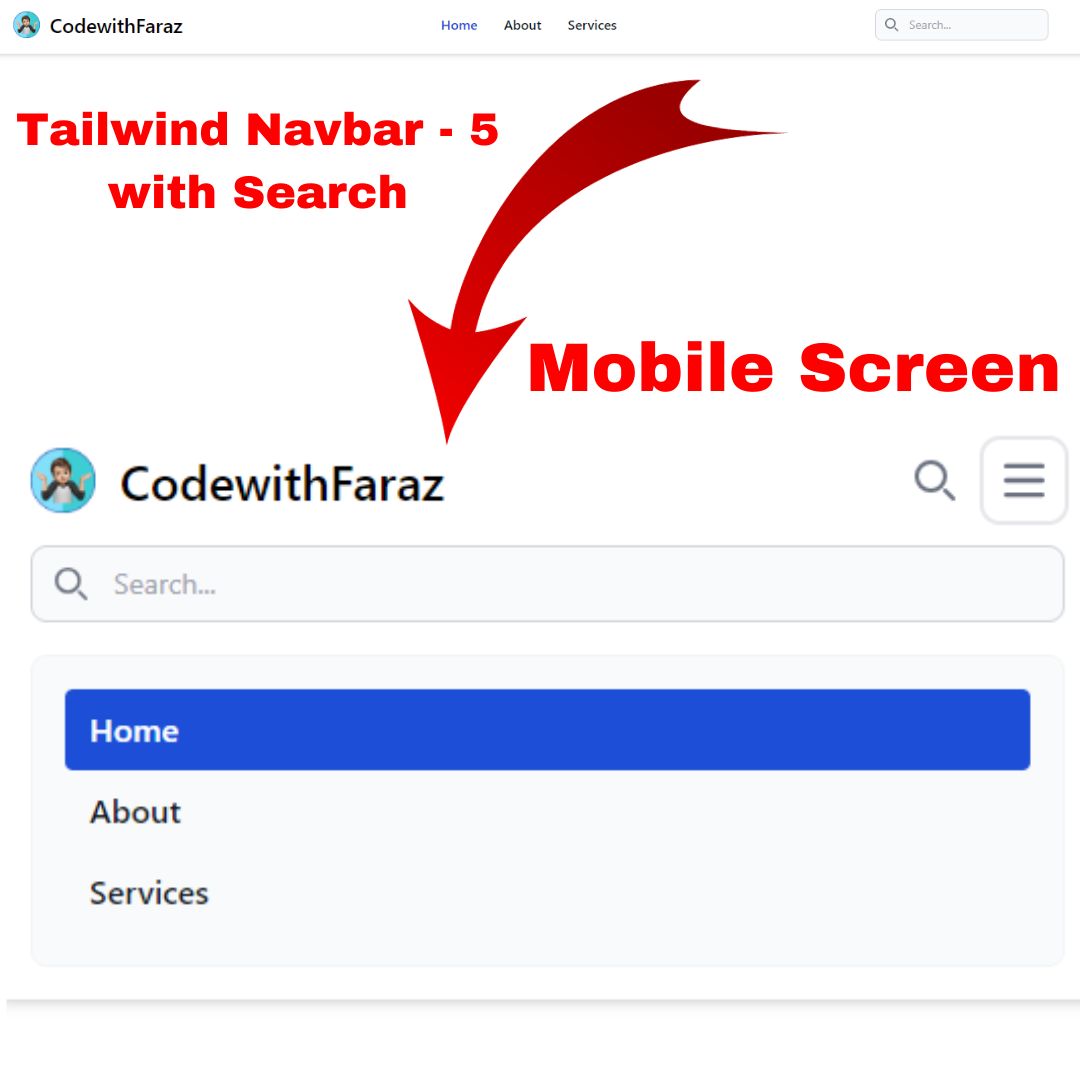
Create a Navigation Bar with Search Using Tailwind CSS
Learn how to create a sleek navigation bar with search functionality using Tailwind CSS. A step-by-step tutorial for web developers.
-
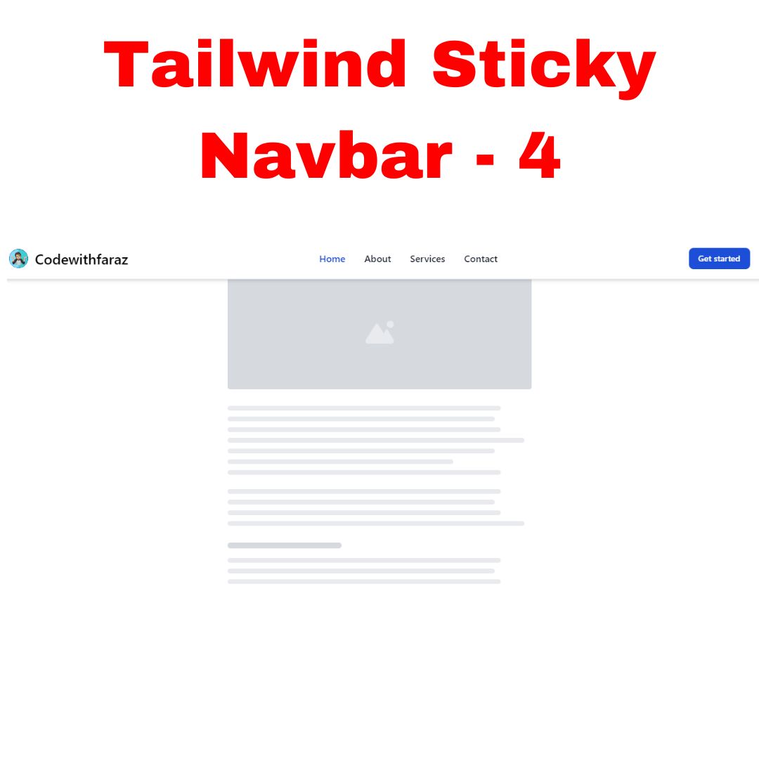
Create Sticky Navbar with Tailwind CSS
Learn how to design a sticky navbar effortlessly using Tailwind CSS. Follow our detailed guide and make your website navigation stand out!
-
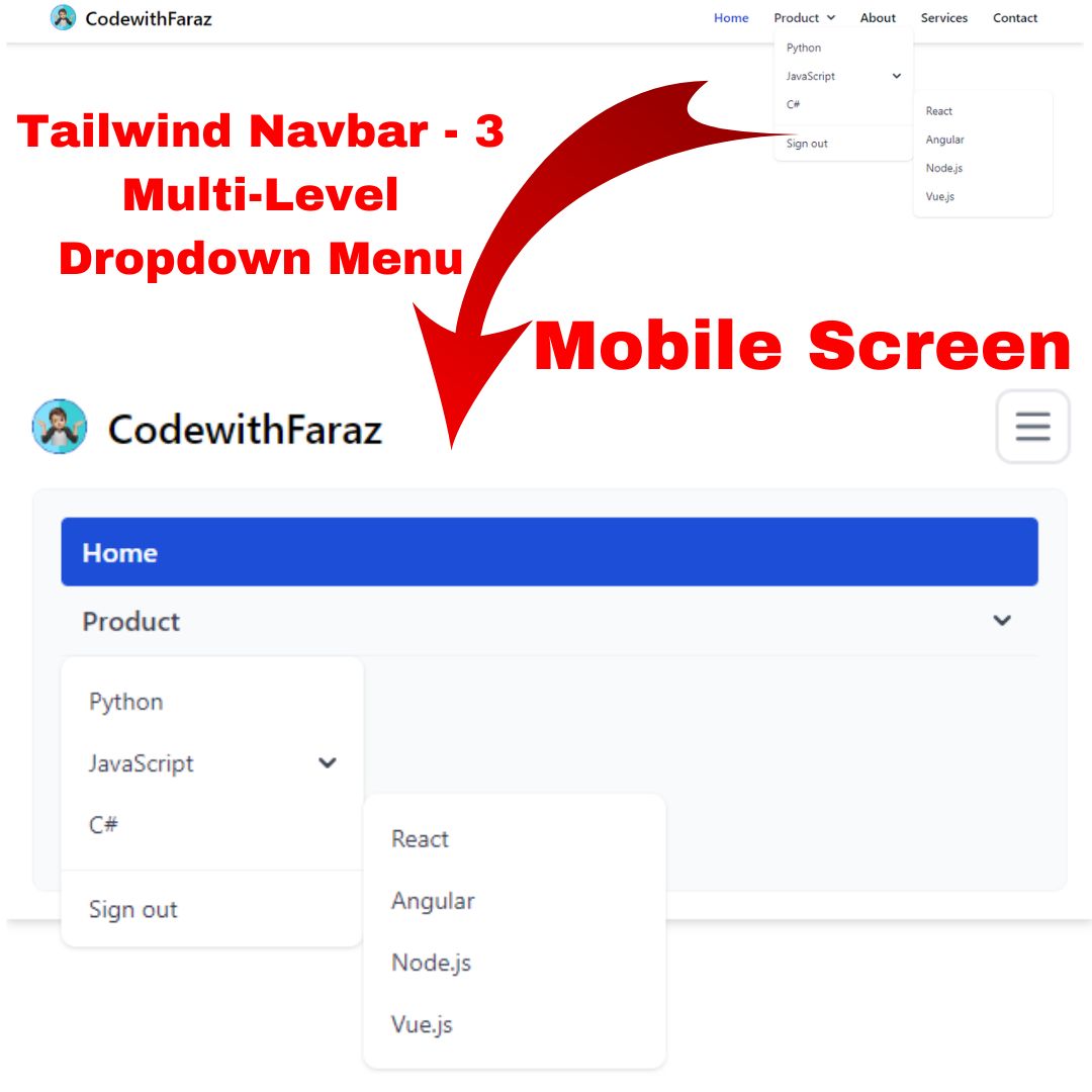
Responsive Navbar with Multi-Level Dropdown Menu using Tailwind CSS
Learn to build a responsive navbar with multi-level dropdown menus using Tailwind CSS. Enhance your web UI with this step-by-step tutorial.
-
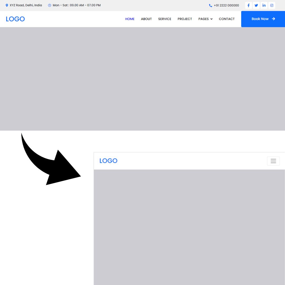
Create a Responsive Bootstrap 5 Navbar with Topbar
Learn how to build a responsive Bootstrap 5 navbar with a topbar for seamless navigation. Follow our web development guide for easy implementation.
-
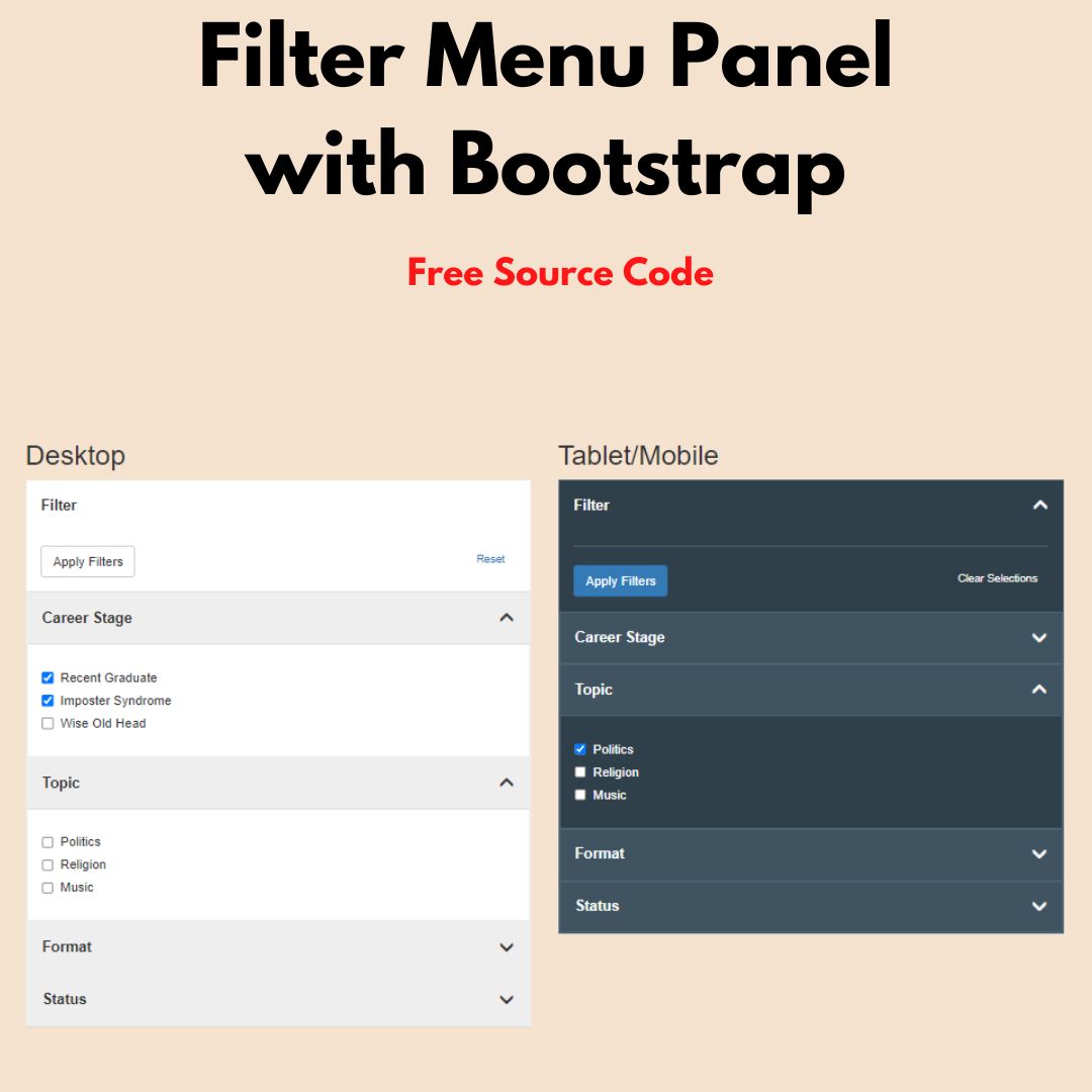
Creating an Efficient Filter Menu Panel Group with Bootstrap for Better User Experience
Learn how to create an efficient filter menu panel group with Bootstrap for better user experience. Follow best practices for designing filtering options and sorting.
-
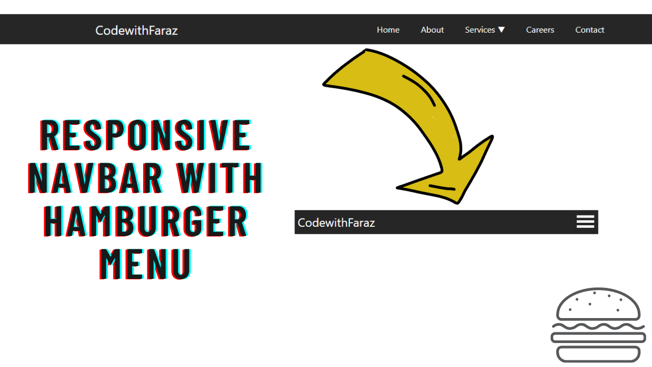
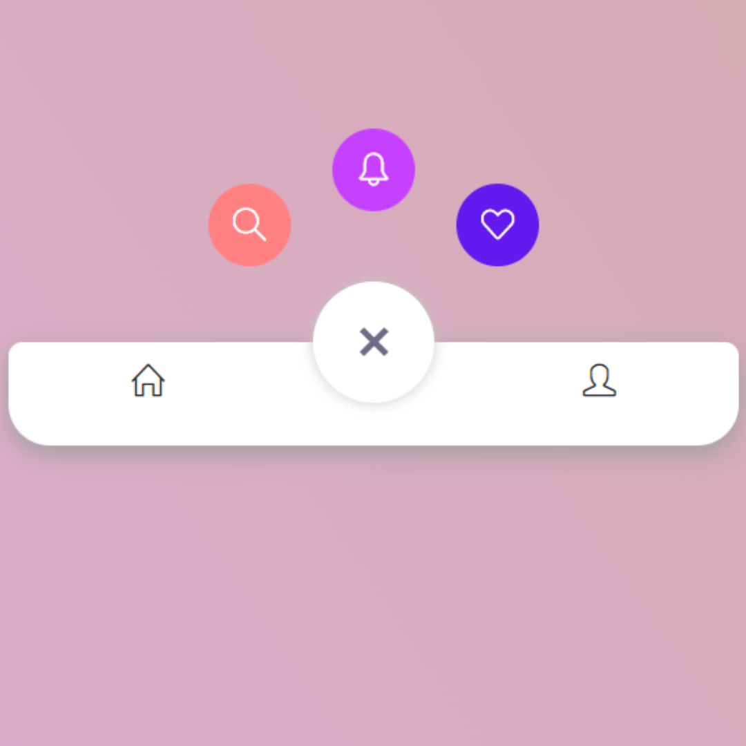
How to Create a Responsive Navbar with Hamburger Menu Using HTML, CSS and JavaScript
Learn how to create a responsive navigation bar with hamburger menu using HTML, CSS, and JavaScript. Follow our step-by-step tutorial to build a mobile-friendly navbar for your website.
-
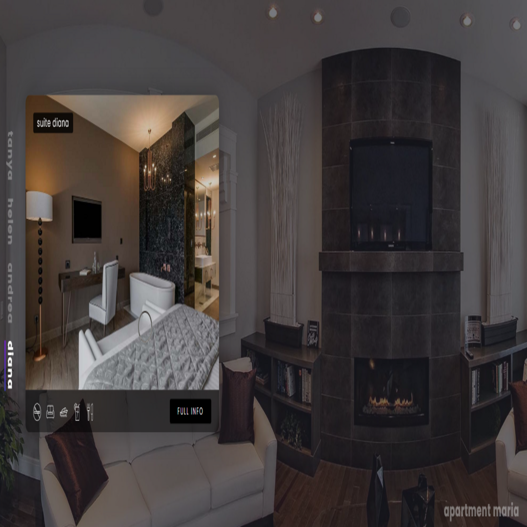
Responsive Hotel Landing Page with HTML, CSS, and JavaScript
Learn how to create a responsive hotel landing page using HTML, CSS and JavaScript to attract more bookings and improve user experience.
-
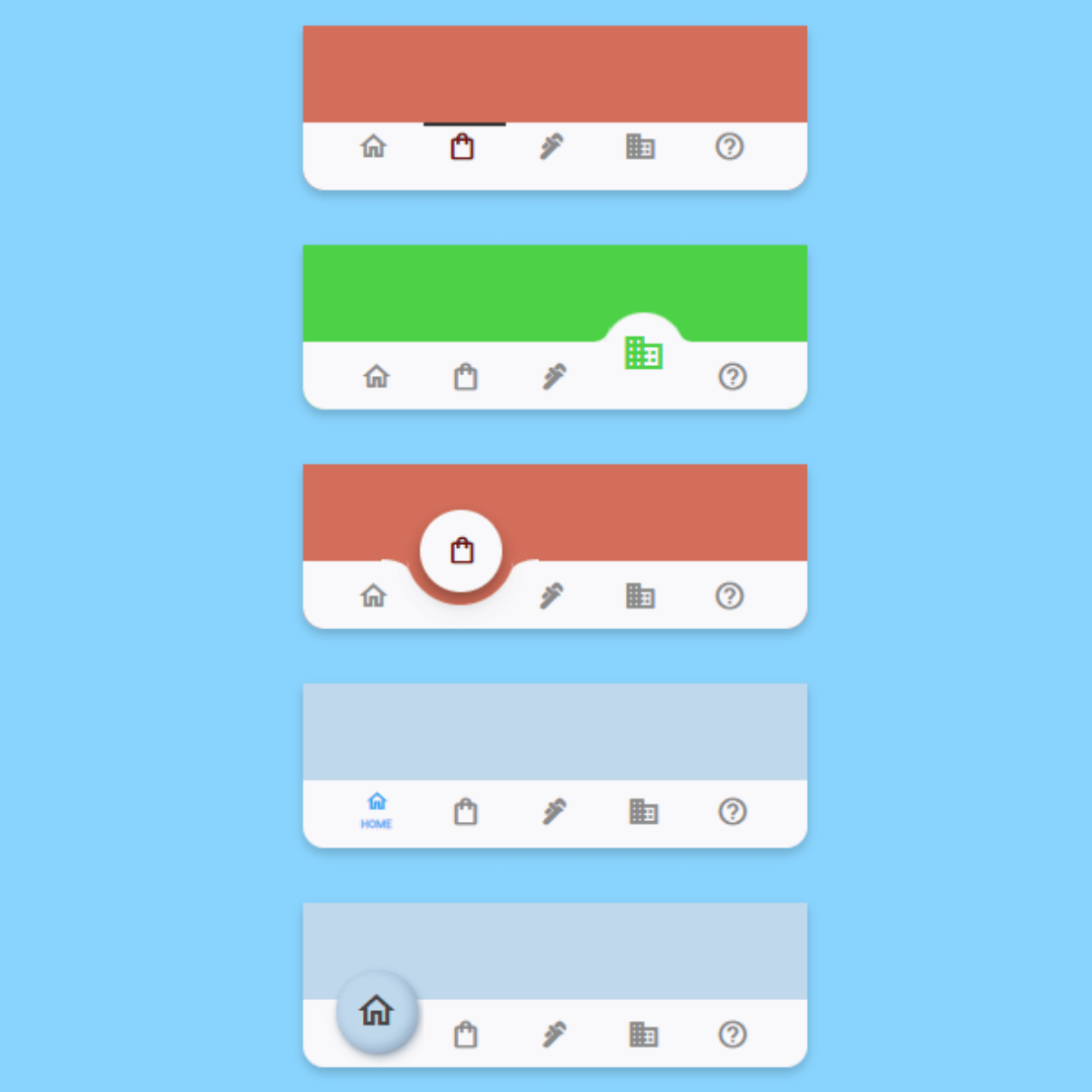
5 Cool Types of Animated Bottom Navigation Bar Using HTML, CSS and JavaScript
Learn how to create 5 stylish animated bottom navigation bars with HTML, CSS, and JavaScript. Add smooth transitions and improve your site’s navigation!
-

Create an Animated Hamburger Menu - HTML, CSS, JS Tutorial
Learn how to create a tasty CSS-animated hamburger menu for responsive web design. Follow our step-by-step tutorial using HTML, CSS, and JavaScript.
-
How to Create a Bottom Tab Bar Navigation Using HTML and Pure CSS
Learn how to create a responsive and mobile-friendly bottom tab bar navigation using only HTML and CSS.
-
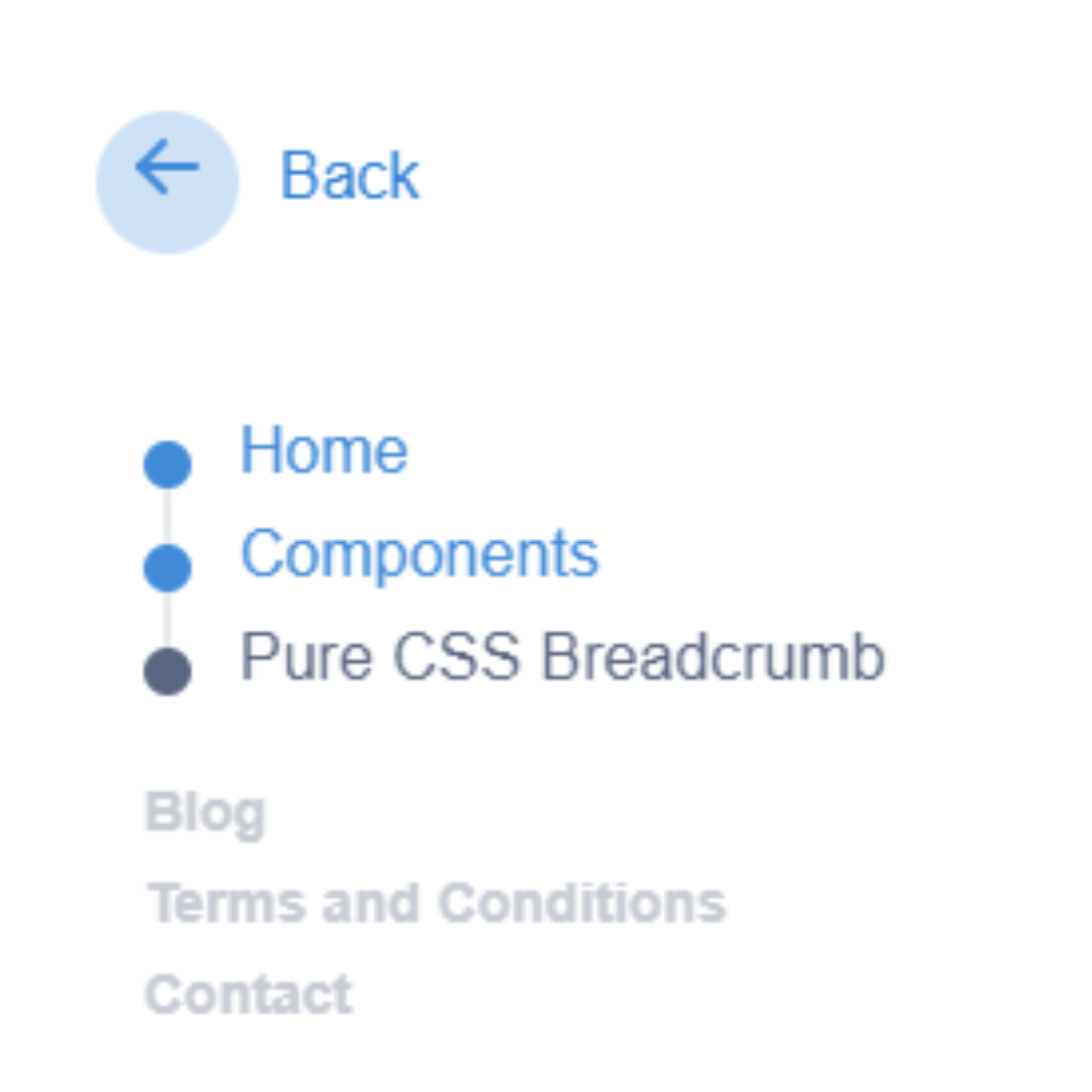
Create an Eye-catching Breadcrumb Navigation in CSS with HTML
Learn how to design an eye-catching breadcrumb navigation for your website using CSS and HTML.