Learn how to create an animated dual login/signup form that provides an excellent user experience. Our article covers best practices for web design, front-end development, and interaction design.

Table of Contents
In today's digital age, creating an engaging and interactive user experience is more important than ever. One way to achieve this is through the use of animations in web design. In this tutorial, we will be showing you how to create an animated dual login/signup form using HTML, CSS, and JavaScript. Not only will this enhance the overall look and feel of your website, but it will also make the login and signup process more intuitive and user-friendly.
To start, we will first discuss the HTML and CSS needed to create the basic structure and layout of the form. We will use HTML to create the form elements and labels, and CSS to style and position them. We will also be using CSS animations to add movement and visual appeal to the form.
Next, we will move on to the JavaScript aspect of the tutorial. We will be using JavaScript to add interactivity and functionality to the form, such as toggling between the login and signup sections and implementing basic form validation.
By the end of this tutorial, you will have a fully functional and animated dual login/signup form that is both visually appealing and user-friendly. Not only will you have a deeper understanding of HTML, CSS, and JavaScript, but you will also be able to apply these skills to other web design projects. So, let's dive in and start building our animated dual login/signup form!
Let's start making these animated dual login/signup forms using HTML, CSS, and JavaScript step by step.
Join My Telegram Channel to Download the Project: Click Here
Source Code
Step 1 (HTML Code):
To get started, we will first need to create a basic HTML file. In this file, we will include the main structure for our login / signup form.
In the head section, it includes the title of the page and meta tags to set the character encoding and viewport. It also includes links to external CSS stylesheets, including Bootstrap and Font Awesome, which are used for styling and adding icons to the form.
In the body section, it starts with a background animation of ocean waves and then continues with the layout of the form which is divided into two sections, one for login and the other for signup. The form is wrapped in a container div and is designed with CSS classes and Bootstrap.
There are also social media icons included in the form which are implemented with Font Awesome.
The code uses Bootstrap and Font Awesome libraries to build the form with responsive design and add icons.
The form is divided into two sections, one for login and the other for signup, and has social media icons, and also some basic validation.
It also has an animation of ocean waves in the background.
After creating the files just paste the following codes into your file. Make sure to save your HTML document with a .html extension, so that it can be properly viewed in a web browser.
This is the basic structure of our login / signup form using HTML, and now we can move on to styling it using CSS.
Step 2 (CSS Code):
Once the basic HTML structure of the login/signup forms is in place, the next step is to add styling to the login/signup forms using CSS. CSS allows us to control the visual appearance of the website, including things like layout, color, and typography.
In this file, we will use some basic CSS rules to create our login/signup forms. We will also add some padding and margin properties to ensure that everything looks correct.
The CSS is used to set the width, height, and display properties of the container div which holds the form. It also sets the justify-content and align-items properties to center the form on the page.
It also used to set some styles for the input fields, such as font-size, padding, and border-radius, and also to style the form labels, buttons, and social media icons.
It also uses CSS animations to add movement and visual appeal to the form, such as toggling between the login and signup sections.
It also uses CSS to style the background ocean animation.
This will give our login/signup forms an upgraded presentation. Create a CSS file with the name of styles.css and paste the given codes into your CSS file. Remember that you must create a file with the .css extension.
html, body {
  width: 100%;
  height: 100%;
}
body {
  background:radial-gradient(ellipse at center, rgba(255,254,234,1) 0%, rgba(255,254,234,1) 35%, #B7E8EB 100%);
  overflow: hidden;
}

.ocean {
  height: 5%;
  width:100%;
  position:absolute;
  bottom:0;
  left:0;
  background: #015871;
}

.wave {
  background: url(https://s3-us-west-2.amazonaws.com/s.cdpn.io/85486/wave.svg) repeat-x;
  position: absolute;
  top: -198px;
  width: 6400px;
  height: 198px;
  animation: wave 5s cubic-bezier( 0.36, 0.45, 0.63, 0.53) infinite;
  transform: translate3d(0, 0, 0);
}

.wave:nth-of-type(2) {
  top: -175px;
  animation: wave 7s cubic-bezier( 0.36, 0.45, 0.63, 0.53) -.125s infinite, swell 7s ease -1.25s infinite;
  opacity: 1;
}

@keyframes wave {
  0% {
      margin-left: 0;
  }
  100% {
      margin-left: -1600px;
  }
}

@keyframes swell {
  0%, 100% {
      transform: translate3d(0,-25px,0);
  }
  50% {
      transform: translate3d(0,5px,0);
  }
}

/* Login Section Style */
* {
  box-sizing: border-box;
}

body {
  font-family: 'Montserrat', sans-serif;
  display: flex;
  flex-direction: column;
  justify-content: center;
  align-items: center;
  height: 100vh;
  margin: -20px 0 50px;
  margin-top: 20px;
}

h1 {
  font-weight: bold;
  margin: 0;
}

p {
  font-size: 14px;
  font-weight: 100;
  line-height: 20px;
  letter-spacing: .5px;
  margin: 20px 0 30px;
}

span {
  font-size: 12px;
}

a {
  color: #0e263d;
  font-size: 14px;
  text-decoration: none;
  margin: 15px 0;
}

.container {
  background: #fff;
  border-radius: 90px;
  box-shadow: 30px 14px 28px rgba(0, 0, 5, .2), 0 10px 10px rgba(0, 0, 0, .2);
  position: relative;
  overflow: hidden;
  opacity: 85%;
  width: 768px;
  max-width: 100%;
  min-height: 480px;
  transition: 333ms;
}


.form-container form {
  background: #fff;
  display: flex;
  flex-direction: column;
  padding:  0 50px;
  height: 100%;
  justify-content: center;
  align-items: center;
  text-align: center;
}

.social-container {
  margin: 20px 0;
  display: block;
}


.social-container a {
  border: 1px solid #008ecf;
  border-radius: 50%;
  display: inline-flex;
  justify-content: center;
  align-items: center;
  margin: 0 5px;
  height: 40px;
  width: 40px;
  transition: 333ms;
}
.social-container a:hover {
  transform: rotateZ(13deg);
  border: 1px solid #0e263d;
}

.form-container input {
  background: #eee;
  border: none;
  border-radius: 50px;
  padding: 12px 15px;
  margin: 8px 0;
  width: 100%;
}
.form-container input:hover {
  transform: scale(101%);
}

button {
  border-radius: 50px;
  box-shadow: 0 1px 1px ;
  border: 1px solid #008ecf;
  background: #008ecf;
  color: #fff;
  font-size: 12px;
  font-weight: bold;
  padding: 12px 45px;
  letter-spacing: 1px;
  text-transform: uppercase;
  transition: transform 80ms ease-in;
}

button:active {
  transform: scale(.95);
}

button:focus {
  outline: none;
}

button.ghost {
  background: transparent;
  border-color: #fff;
}

.form-container {
  position: absolute;
  top: 0;
  height: 100%;
  transition: all .6s ease-in-out;
}

.sign-in-container {
  left: 0;
  width: 50%;
  z-index: 2;
}

.sign-up-container {
  left: 0;
  width: 50%;
  z-index: 1;
  opacity: 0;
}

.overlay-container {
  position: absolute;
  top: 0;
  left: 50%;
  width: 50%;
  height: 100%;
  overflow: hidden;
  transition: transform .6s ease-in-out;
  z-index: 100;
}

.overlay {
  background: #ff416c;
  background: linear-gradient(to right, #008ecf, #008ecf) no-repeat 0 0 / cover;
  color: #fff;
  position: relative;
  left: -100%;
  height: 100%;
  width: 200%;
  transform: translateY(0);
  transition: transform .6s ease-in-out;
}

.overlay-panel {
  position: absolute;
  top: 0;
  display: flex;
  flex-direction: column;
  justify-content: center;
  align-items: center;
  padding: 0 40px;
  height: 100%;
  width: 50%;
  text-align: center;
  transform: translateY(0);
  transition: transform .6s ease-in-out;
}

.overlay-right {
  right: 0;
  transform: translateY(0);
}

.overlay-left {
  transform: translateY(-20%);
}

/* Move signin to right */
.container.right-panel-active .sign-in-container {
  transform: translateY(100%);
}

/* Move overlay to left */
.container.right-panel-active .overlay-container {
  transform: translateX(-100%);
}

/* Bring signup over signin */
.container.right-panel-active .sign-up-container {
  transform: translateX(100%);
  opacity: 1;
  z-index: 5;
}

/* Move overlay back to right */
.container.right-panel-active .overlay {
  transform: translateX(50%);
}

/* Bring back the text to center */
.container.right-panel-active .overlay-left {
  transform: translateY(0);
}

/* Same effect for right */
.container.right-panel-active .overlay-right {
  transform: translateY(20%);
}
Step 3 (JavaScript Code):
The final step in creating an animated dual login/signup form using HTML, CSS, and JavaScript is to add interactivity to the website using JavaScript. JavaScript allows us to create dynamic and interactive elements on the website, such as forms, modals, and image sliders.
By adding interactivity to the website with JavaScript, we are providing an engaging and interactive experience for users, making the website more usable and enjoyable. This step is essential in creating a website that encourages user engagement and ultimately drives more business to the website.
We will be using JavaScript to add interactivity and functionality to the form, such as toggling between the login and signup sections, and implementing basic form validation.
Create a JavaScript file with the name of script.js and paste the given codes into your JavaScript file and make sure it's linked properly to your HTML document, so that the scripts are executed on the page. Remember, you’ve to create a file with .js extension.
const signUpButton = document.getElementById('signUp');
const signInButton = document.getElementById('signIn');
const container = document.getElementById('container');

signUpButton.addEventListener('click', () =>
    container.classList.add('right-panel-active'));

signInButton.addEventListener('click', () =>
    container.classList.remove('right-panel-active'));
Final Output:

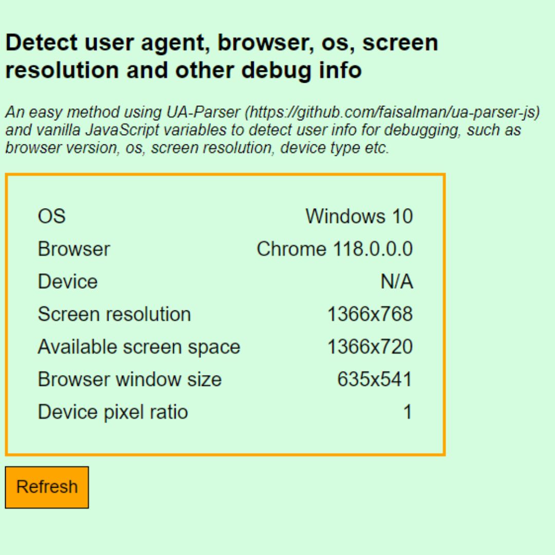
 Detect User's Browser, Screen Resolution, OS, and More with JavaScript using UAParser.js Library
Conclusion:
In conclusion, designing an animated dual login/signup form that provides an excellent user experience requires careful consideration of various aspects, such as design, interactivity, and accessibility. By following best practices and incorporating animations and interactivity, we can create a form that not only fulfills its functional purpose but also delights users. It's essential to keep accessibility in mind and ensure that our form is accessible to everyone. A well-designed login/signup form can greatly enhance the overall user experience and help our website stand out.
That’s a wrap!
I hope you enjoyed this post. Now, with these examples, you can create your own amazing page.
Did you like it? Let me know in the comments below 🔥 and you can support me by buying me a coffee
And don’t forget to sign up to our email newsletter so you can get useful content like this sent right to your inbox!
Thanks!
Faraz 😊


