Learn how to create a simple webpage layout using HTML and CSS. Follow this easy guide to build a clean, responsive layout for your website.

Table of Contents
Creating a webpage might sound complicated, but it's easier than you think! In this blog, we'll show you how to design a simple webpage layout using HTML (HyperText Markup Language) and CSS (Cascading Style Sheets). These two languages are the backbone of web development. HTML is used to structure your content, while CSS is used to style it.
By the end of this guide, you'll be able to create a basic webpage that includes a header, a main section, and a footer. This simple layout will give you a strong foundation to build on as you learn more about web design.
You don't need any previous coding experience. All you need is a text editor (like Notepad++ or Visual Studio Code) and a web browser (like Google Chrome or Firefox). We will provide clear, step-by-step instructions so you can follow along easily. Let’s get started and make your first webpage!
Source Code
Step 1 (HTML Code):
To get started, we will first need to create a basic HTML file. In this file, we will include the main structure for our webpage layout.
Here is a breakdown of each section of the HTML code:
1. DOCTYPE and HTML Tag
<!DOCTYPE html>
<html lang="en">
<!DOCTYPE html>: Tells the browser that the document follows HTML5 standards.<html lang="en">: Declares the language of the webpage as English for accessibility and SEO purposes.
2. Head Section (<head>)
The <head> contains metadata and external links required for styling and functionality.
<head>
  <meta charset="UTF-8" />
  <meta name="viewport" content="width=device-width, initial-scale=1.0" />
  <title>Simple Webpage Layout</title>
  <link rel="stylesheet" href="styles.css" />
  <link href="https://fonts.googleapis..." rel="stylesheet"/>
  <link rel="stylesheet" href="https://cdnjs.cloudfla..."/>
</head>
<meta charset="UTF-8" />: Ensures correct text encoding.<meta name="viewport" content="width=device-width, initial-scale=1.0" />: Makes the site responsive on different devices.<title>: Sets the title of the webpage shown in the browser tab.<link rel="stylesheet" href="styles.css" />: Links an external CSS file for custom styling.- Google Fonts link: Imports the Poppins font to style the text.
- Font Awesome link: Adds icons for enhanced design (e.g., checkmarks, phone icons).
3. Body Section (<body>)
This is the main part of the webpage, containing all visible content.
Navigation Bar
<nav class="navbar">
  <div class="logo">ModernUI</div>
  <ul class="nav-links">
    <li><a href="#home">Home</a></li>
    <li><a href="#services">Services</a></li>
    <li><a href="#about">About</a></li>
    <li><a href="#contact">Contact</a></li>
  </ul>
</nav><nav>: Creates a navigation bar with a logo and navigation links.- The links (e.g., Home, Services) use anchor tags (
<a>) to scroll to specific sections of the webpage.
Hero Section (#home)
<section id="home" class="hero">
  <h1>Elevate Your Web Experience</h1>
  <p>Create modern, fast, and responsive websites with ease.</p>
  <a href="#services" class="btn">Explore Services</a>
</section>- This section acts as the landing page, featuring a title, a short description, and a button that links to the Services section.
Services Section (#services)
<section id="services" class="services">
  <h2>Our Services</h2>
  <div class="cards">
    <div class="card">
      <h3>Design</h3>
      <p>We create beautiful and user-friendly designs tailored to your brand identity.</p>
    </div>
    <div class="card">
      <h3>Development</h3>
      <p>Our code ensures fast, secure, and scalable websites across all platforms.</p>
    </div>
    <div class="card">
      <h3>SEO Optimization</h3>
      <p>We improve your site’s search engine visibility to increase traffic and leads.</p>
    </div>
  </div>
</section>- This section describes the services offered (Design, Development, SEO) using cards. Each card contains a title and a description.
About Section (#about)
<section id="about" class="about">
  <h2>Who We Are</h2>
  <div class="about-container">
    <div class="about-image">
      <img src="https://codewithfaraz.com/tools/placeholder?size=500x300" alt="About Us Image" />
    </div>
    <div class="about-content">
      <h3>Our Mission</h3>
      <p>At ModernUI, we aim to create impactful digital experiences...</p>
      <h3>Why Choose Us?</h3>
      <ul>
        <li><i class="fas fa-check-circle"></i> Creative and Customized Solutions</li>
        <li><i class="fas fa-check-circle"></i> Experienced Team of Experts</li>
        <li><i class="fas fa-check-circle"></i> Dedicated Customer Support</li>
      </ul>
    </div>
  </div>
</section><img>: Displays an image about the organization.<ul>: An unordered list showing benefits of the company, enhanced with Font Awesome check icons.
Contact Section (#contact)
<section id="contact" class="contact">
  <h2 class="clr-g">Get In Touch</h2>
  <div class="contact-container">
    <div class="contact-form">
      <h3>Send Us a Message</h3>
      <form action="#" method="POST">
        <input type="text" name="name" placeholder="Your Name" required />
        <input type="email" name="email" placeholder="Your Email" required />
        <textarea name="message" rows="5" placeholder="Your Message" required ></textarea>
        <button type="submit">Submit</button>
      </form>
    </div>
    <div class="contact-details">
      <h3 class="clr-g">Contact Information</h3>
      <p><i class="fas fa-phone-alt"></i> <a href="tel:+1234567890">+1 (234) 567-890</a></p>
      <p><i class="fas fa-envelope"></i> <a href="mailto:[email protected]">[email protected]</a></p>
      <p><i class="fas fa-map-marker-alt"></i> 123 Web Street, Tech City, USA</p>
      <div class="social-links">
        <a href="#"><i class="fab fa-facebook-f"></i></a>
        <a href="#"><i class="fab fa-twitter"></i></a>
        <a href="#"><i class="fab fa-instagram"></i></a>
        <a href="#"><i class="fab fa-linkedin-in"></i></a>
      </div>
    </div>
  </div>
</section>- Contact Form: Allows users to send messages with name, email, and message fields.
- Contact Details: Displays phone, email, and address using Font Awesome icons.
- Social Links: Links to social media pages with icons (e.g., Facebook, Instagram).
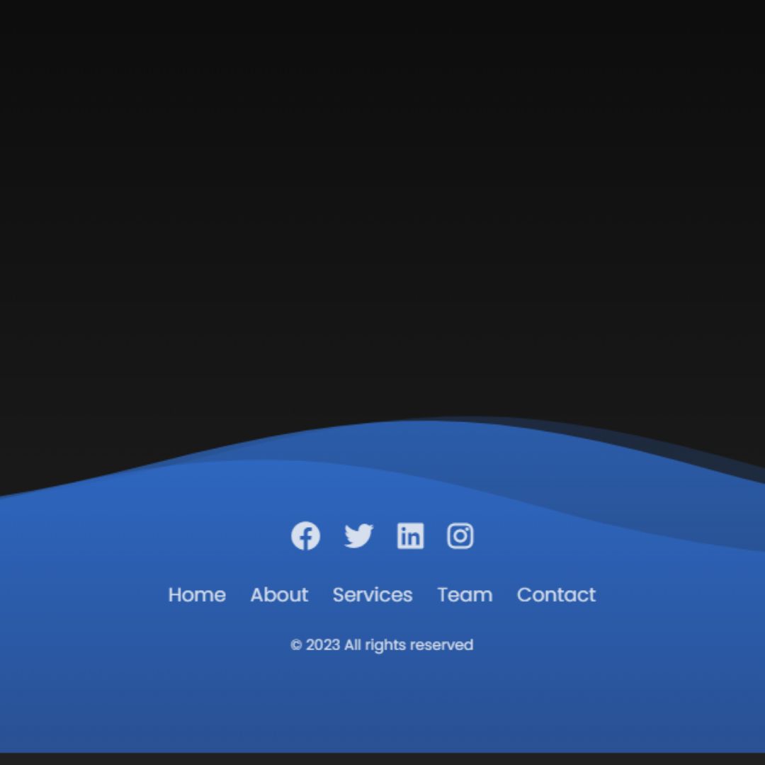
Footer Section
<footer class="footer">
  <p>© 2025 ModernUI. All rights reserved.</p>
</footer>- This footer marks the end of the webpage, displaying a copyright notice.
Step 2 (CSS Code):
Next, we need to style our webpage by adding the CSS. This will give our webpage an upgraded presentation. Create a CSS file with the name of styles.css and paste the given codes into your CSS file. Remember that you must create a file with the .css extension.
Here’s a detailed explanation of the CSS code:
Global Styling
* {
  margin: 0;
  padding: 0;
  box-sizing: border-box;
}*selector applies to all elements.- Removes default margin and padding to ensure consistent styling.
box-sizing: border-box;makes padding and borders included within the element's width and height.
Body Styling
body {
  font-family: 'Poppins', sans-serif;
  background-color: #f5f5f5;
  color: #333;
  line-height: 1.6;
}- Sets Poppins as the main font (from Google Fonts).
background-color: #f5f5f5;applies a light gray background.- Text color is set to
#333(dark gray). line-height: 1.6;improves readability by increasing line spacing.
Navbar Styling
.navbar {
  display: flex;
  justify-content: space-between;
  align-items: center;
  padding: 20px;
  background-color: #333;
  color: #fff;
  position: sticky;
  top: 0;
  z-index: 100;
}- The navbar is a flex container with:
justify-content: space-between;to position the logo and links on opposite sides.align-items: center;vertically centers elements.
position: sticky;keeps the navbar fixed at the top during scrolling.z-index: 100;ensures it stays above other content.
Navbar Links
.nav-links {
  list-style: none;
  display: flex;
}
.nav-links li {
  margin-left: 20px;
}
.nav-links a {
  color: white;
  text-decoration: none;
  font-weight: 500;
  transition: color 0.3s;
}
.nav-links a:hover {
  color: #f39c12;
}- Removes bullet points from the navbar links.
- Navbar links are horizontally aligned using
display: flex;. - Links turn orange (#f39c12) on hover for a smooth transition.
Hero Section
.hero {
  height: 100vh;
  background: linear-gradient(135deg, #3498db, #8e44ad);
  color: white;
  display: flex;
  flex-direction: column;
  align-items: center;
  justify-content: center;
  text-align: center;
  padding: 20px;
}- The hero section covers the entire viewport (100vh).
- Uses a diagonal gradient background from blue (#3498db) to purple (#8e44ad).
flex-direction: column;aligns the content vertically.
Button in Hero Section
.hero .btn {
  background-color: #f39c12;
  color: white;
  padding: 10px 20px;
  border: none;
  border-radius: 25px;
  text-decoration: none;
  transition: background-color 0.3s;
}
.hero .btn:hover {
  background-color: #d35400;
}- A rounded button with orange color that darkens slightly on hover.
Services Section
.services {
  padding: 50px;
  background-color: white;
  text-align: center;
}
.cards {
  display: grid;
  grid-template-columns: repeat(auto-fit, minmax(250px, 1fr));
  gap: 20px;
}
.card {
  padding: 20px;
  background-color: #3498db;
  color: white;
  border-radius: 10px;
  transition: transform 0.3s;
  text-align: center;
}
.card:hover {
  transform: translateY(-10px);
}- Uses CSS Grid to arrange service cards dynamically.
- Each card moves up by 10px on hover for a subtle effect.
- Grid auto-fit ensures cards adjust based on screen size.
About Section
.about {
  padding: 50px;
  background-color: #f4f4f4;
}
.about-container {
  display: flex;
  flex-wrap: wrap;
  gap: 30px;
  align-items: center;
  justify-content: space-between;
}
.about-image img {
  max-width: 100%;
  border-radius: 10px;
  box-shadow: 0 4px 8px rgba(0, 0, 0, 0.1);
}
flex-wrap: wrap;ensures the layout adjusts for smaller screens.- The image has a border-radius for rounded corners and a shadow for depth.
Content and Icons Styling
.about-content h3 {
  margin-top: 20px;
  color: #333;
}
.about-content ul {
  list-style: none;
  padding: 0;
}
.about-content li {
  margin: 10px 0;
  font-size: 1rem;
}
.about-content i {
  color: #27ae60;
  margin-right: 10px;
}- The icons (like checkmarks) are styled green (#27ae60) to highlight key points.
Contact Section Styling
.contact {
  padding: 50px;
  background-color: #2c3e50;
  color: white;
}- The contact section has 50 pixels of padding for spacing and a dark blue background color (#2c3e50).
- Text color is set to white for good contrast.
Contact Container
.contact-container {
  display: flex;
  flex-wrap: wrap;
  gap: 30px;
  align-items: flex-start;
  justify-content: space-between;
}- The contact-container uses flexbox to create a flexible layout.
flex-wrap: wrap;allows items to move to the next line if they exceed the container's width.gap: 30px;provides spacing between child elements.align-items: flex-start;aligns items at the top of the container.justify-content: space-between;distributes extra space between items, pushing them to the sides.
Contact Form Styling
.contact-form {
  flex: 1;
  min-width: 300px;
}
.clr-g {
  color: #27ae60;
}- The contact-form takes up equal space in the flex container with
flex: 1;. min-width: 300px;ensures the form doesn't get too small on narrow screens..clr-gis a utility class that sets the text color to a green shade (#27ae60).
Contact Form Header
.contact-form h3 {
  margin-bottom: 20px;
}- The heading in the contact form has a bottom margin of 20 pixels for spacing below it.
Input Fields and Textarea
.contact-form input,
.contact-form textarea {
  width: 100%;
  padding: 10px;
  margin-bottom: 15px;
  border: none;
  border-radius: 5px;
}- Both input fields and textarea are styled to take up the full width of the form.
padding: 10px;adds space inside the fields for comfort.margin-bottom: 15px;provides space below each field.- Borders are removed for a cleaner look, and corners are rounded with
border-radius: 5px;.
Submit Button Styling
.contact-form button {
  font-family: 'Poppins', sans-serif;
  width: 100%;
  padding: 10px;
  background-color: #27ae60;
  color: white;
  border: none;
  border-radius: 5px;
  cursor: pointer;
  transition: background-color 0.3s;
}
.contact-form button:hover {
  background-color: #1e8449;
}- The submit button uses the Poppins font, takes up full width, and has padding for comfort.
- It has a green background and white text for contrast.
- The button's background color changes to a darker green (#1e8449) when hovered over, providing a visual cue.
Contact Details Styling
.contact-details {
  flex: 1;
  min-width: 300px;
}
.contact-details p {
  margin: 10px 0;
  font-size: 1.1rem;
}
.contact-details i {
  margin-right: 10px;
}- Similar to the contact form, the contact-details section uses flexbox and has a minimum width.
- Paragraphs within this section have a top and bottom margin of 10 pixels and a slightly larger font size for readability.
- Icons (Font Awesome) have a right margin for spacing between the icon and text.
Contact Details Links
.contact-details a {
  text-decoration: none;
  color: inherit;
}- Links within the contact-details section have no underline and inherit the text color, keeping the design consistent.
Social Links Styling
.social-links a {
  margin: 0 10px;
  color: white;
  font-size: 1.5rem;
  transition: color 0.3s;
}
.social-links a:hover {
  color: #27ae60;
}- Social media links are styled with horizontal margins for spacing, white text, and an increased font size for visibility.
- On hover, the link color changes to green (#27ae60) for interaction feedback.
Footer Styling
.footer {
  padding: 20px;
  background-color: #333;
  color: white;
  text-align: center;
}- The footer has 20 pixels of padding, a dark background (#333), and white text for contrast.
text-align: center;centers the text within the footer for a balanced look.
* {
  margin: 0;
  padding: 0;
  box-sizing: border-box;
}

body {
  font-family: 'Poppins', sans-serif;
  background-color: #f5f5f5;
  color: #333;
  line-height: 1.6;
}

.navbar {
  display: flex;
  justify-content: space-between;
  align-items: center;
  padding: 20px;
  background-color: #333;
  color: #fff;
  position: sticky;
  top: 0;
  z-index: 100;
}

.nav-links {
  list-style: none;
  display: flex;
}

.nav-links li {
  margin-left: 20px;
}

.nav-links a {
  color: white;
  text-decoration: none;
  font-weight: 500;
  transition: color 0.3s;
}

.nav-links a:hover {
  color: #f39c12;
}

.hero {
  height: 100vh;
  background: linear-gradient(135deg, #3498db, #8e44ad);
  color: white;
  display: flex;
  flex-direction: column;
  align-items: center;
  justify-content: center;
  text-align: center;
  padding: 20px;
}

.hero h1 {
  font-size: 3rem;
  margin-bottom: 10px;
}

.hero p {
  font-size: 1.2rem;
  margin-bottom: 20px;
}

.hero .btn {
  background-color: #f39c12;
  color: white;
  padding: 10px 20px;
  border: none;
  border-radius: 25px;
  text-decoration: none;
  transition: background-color 0.3s;
}

.hero .btn:hover {
  background-color: #d35400;
}

.services {
  padding: 50px;
  background-color: white;
  text-align: center;
}

.services h2 {
  margin-bottom: 30px;
}

.cards {
  display: grid;
  grid-template-columns: repeat(auto-fit, minmax(250px, 1fr));
  gap: 20px;
}

.card {
  padding: 20px;
  background-color: #3498db;
  color: white;
  border-radius: 10px;
  transition: transform 0.3s;
  text-align: center;
}

.card:hover {
  transform: translateY(-10px);
}

.about {
  padding: 50px;
  background-color: #f4f4f4;
}

.about-container {
  display: flex;
  flex-wrap: wrap;
  gap: 30px;
  align-items: center;
  justify-content: space-between;
}

.about-image img {
  max-width: 100%;
  border-radius: 10px;
  box-shadow: 0 4px 8px rgba(0, 0, 0, 0.1);
}

.about-content h3 {
  margin-top: 20px;
  color: #333;
}

.about-content p {
  margin: 10px 0;
  line-height: 1.6;
}

.about-content ul {
  list-style: none;
  padding: 0;
}

.about-content li {
  margin: 10px 0;
  font-size: 1rem;
}

.about-content i {
  color: #27ae60;
  margin-right: 10px;
}

.contact {
  padding: 50px;
  background-color: #2c3e50;
  color: white;
}

.contact-container {
  display: flex;
  flex-wrap: wrap;
  gap: 30px;
  align-items: flex-start;
  justify-content: space-between;
}

.contact-form {
  flex: 1;
  min-width: 300px;
}

.clr-g{
  color: #27ae60;
}

.contact-form h3 {
  margin-bottom: 20px;
}

.contact-form input,
.contact-form textarea {
  width: 100%;
  padding: 10px;
  margin-bottom: 15px;
  border: none;
  border-radius: 5px;
}

.contact-form button {
  font-family: 'Poppins', sans-serif;
  width: 100%;
  padding: 10px;
  background-color: #27ae60;
  color: white;
  border: none;
  border-radius: 5px;
  cursor: pointer;
  transition: background-color 0.3s;
}

.contact-form button:hover {
  background-color: #1e8449;
}

.contact-details {
  flex: 1;
  min-width: 300px;
}

.contact-details p {
  margin: 10px 0;
  font-size: 1.1rem;
}

.contact-details i {
  margin-right: 10px;
}

.contact-details a {
  text-decoration: none;
  color: inherit;
}

.social-links a {
  margin: 0 10px;
  color: white;
  font-size: 1.5rem;
  transition: color 0.3s;
}

.social-links a:hover {
  color: #27ae60;
}

.footer {
  padding: 20px;
  background-color: #333;
  color: white;
  text-align: center;
}
Final Output:

Conclusion:
You’ve completed your first webpage layout! By using HTML and CSS, you've created a simple and functional design. The layout includes a header for navigation, a main section for your content, and a footer for additional information.
Understanding this basic structure is an essential step in your journey as a web developer. From here, you can explore more advanced features, like adding images, creating forms, and using different styles to enhance your webpage. The skills you've learned today will serve as a foundation for more complex projects in the future.
Remember, practice is key! Keep experimenting with your design, and don’t hesitate to try new things. The more you practice, the more comfortable you'll become with coding. If you have any questions or want to share your progress, feel free to reach out.
That’s a wrap!
I hope you enjoyed this post. Now, with these examples, you can create your own amazing page.
Did you like it? Let me know in the comments below 🔥 and you can support me by buying me a coffee
And don’t forget to sign up to our email newsletter so you can get useful content like this sent right to your inbox!
Thanks!
Faraz 😊


