Learn how to create a pure CSS modal popup window for your website in this step-by-step guide. No JavaScript needed!

Table of Contents
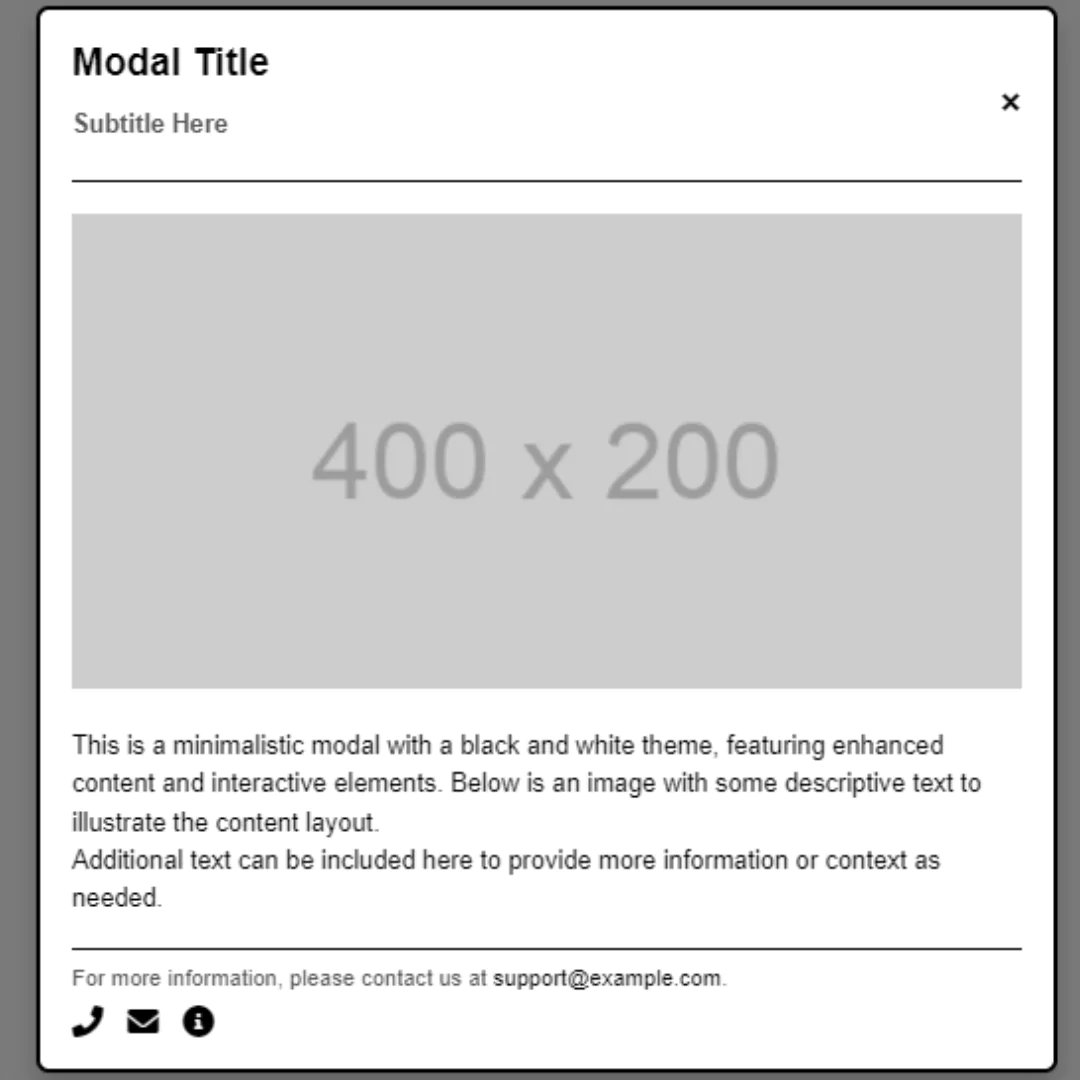
In this blog post, we will be showing you how to create a pure CSS modal popup window for your website. Modal popups are a popular web design element that can provide additional information or functionality to users. Using pure CSS to create a modal popup provides several advantages, including faster page load times, improved accessibility, and more control over the design.
What is a modal window?
A modal window is a type of pop-up window that is typically used for interaction in web applications. Modals are often used for things like asking for input, or displaying information about a particular feature such as an upload button. They're also sometimes used to show hidden content, such as when you want to show more options than can fit on one screen, or when you want to give the user the option of saving some content for later.
Modal windows are a great way to add interactivity to your website. You can take visitors' inputs and present them with different options that they then have to decide whether they want or not.
Let's start making these amazing modal pop-up window Using HTML and Pure CSS step by step.
Source Code
Step 1 (HTML Code):
To get started, we will first need to create a basic HTML file. This HTML file will include the code for your popup window, as well as the CSS for its styling. In this file, you need to create a div element. This div will house all of the elements of your popup window. Next, you need to add a container for your popup window. This container will hold all of the content and style of your popup window.
Here’s a breakdown of the code:
1. DOCTYPE Declaration and HTML Structure
<!DOCTYPE html>
<html lang="en">
<!DOCTYPE html>: Specifies that this is an HTML5 document.<html lang="en">: The root element of the HTML document, withlang="en"indicating the language is English.
2. Head Section
<head>
  <title>Modal Popup Window</title>
  <meta charset="UTF-8" />
  <meta name="viewport" content="width=device-width" />
  <link rel="stylesheet" href="styles.css" />
</head><title>: Sets the title of the webpage, displayed in the browser tab.<meta charset="UTF-8" />: Specifies the character encoding for the document.<meta name="viewport" content="width=device-width" />: Ensures the webpage is responsive by setting the viewport width to match the device's width.<link rel="stylesheet" href="styles.css" />: Links an external CSS file (styles.css) for styling the webpage.
3. Body Section
<body>
  <div class="container">
    <div class="interior">
      <a class="btn" href="#open-modal">Terms and Conditions</a>
    </div>
</div><body>: Contains the main content of the webpage.<div class="container">: A container div for organizing the content.<div class="interior">: A nested div for additional styling or layout purposes.<a class="btn" href="#open-modal">Terms and Conditions</a>: A link that opens the modal window when clicked. Thehref="#open-modal"links to the modal'sid.
4. Modal Window
<div id="open-modal" class="modal-window">
  <div>
    <article class="modal-container">
      <header class="modal-container-header">
        <h1 class="modal-container-title">
          Terms and Conditions
        </h1>
        <button class="icon-button" onclick="location.href='#';">
          <svg xmlns="http://www.w3.org/2000/svg" viewBox="0 0 24 24" width="24" height="24">
            <path fill="none" d="M0 0h24v24H0z" />
            <path fill="currentColor" d="M12 10.586l4.95-4.95 1.414 1.414-4.95 4.95 4.95 4.95-1.414 1.414-4.95-4.95-4.95 4.95-1.414-1.414 4.95-4.95-4.95-4.95L7.05 5.636z" />
          </svg>
        </button>
      </header>
<div id="open-modal" class="modal-window">: The modal container that is initially hidden but displayed when the link is clicked.<article class="modal-container">: Contains the main content of the modal.<header class="modal-container-header">: The header of the modal, which includes the title and a close button.<h1 class="modal-container-title">: Displays the "Terms and Conditions" title inside the modal.<button class="icon-button" onclick="location.href='#';">: A close button that closes the modal when clicked by navigating to the top of the page (removing the#open-modalfrom the URL).<svg>: SVG markup for an "X" icon, used as the close button.
5. Modal Body
<section class="modal-container-body">
  <h2>Quarum ambarum rerum cum medicinam pollicetur, luxuriae licentiam pollicetur.</h2>
  <p>Lorem ipsum dolor sit amet, consectetur adipiscing elit. Unum nescio, quo modo possit, si luxuriosus sit, finitas cupiditates habere. Hoc est non modo cor  </p>
  ...
  <ol>
    <li>Etenim nec iustitia nec amicitia esse omnino poterunt, nisi ipsae per se expetuntur.</li>
    ...
  </ol>
</section>
<section class="modal-container-body">: Contains the body content of the modal, including headings, paragraphs, and an ordered list. This is where the terms and conditions text is displayed.
6. Modal Footer
<footer class="modal-container-footer">
  <button class="button is-ghost">Decline</button>
  <button class="button is-primary">Accept</button>
</footer>
<footer class="modal-container-footer">: Contains the footer of the modal with two buttons, "Decline" and "Accept". These buttons can be programmed to handle user actions (e.g., closing the modal, submitting a form, etc.).
7. Closing Tags
</div>
</div>
</body>
</html>- These closing tags properly end the modal's content, body, and HTML document.
After creating the files just paste the following codes into your file. Remember that you must save a file with the .html extension.
Step 2 (CSS Code):
Next, we need to add the code for our popup window to the CSS file. This code will include the code for our popup window’s content and styling.
Here's a detailed explanation of the CSS code:
1. Global Styles
html,
body {
  height: 100%;
}

html {
  font-size: 18px;
  line-height: 1.4;
}

body {
  font-family: "Segoe UI";
  font-weight: 600;
  background-image: linear-gradient(#e66465, #9198e5);
  color: black;
  overflow: hidden;
}
html, body { height: 100%; }: Ensures that both thehtmlandbodyelements take up the full height of the viewport.html { font-size: 18px; line-height: 1.4; }: Sets the base font size to 18px and the line height to 1.4 times the font size for better readability.body: Applies a specific font (Segoe UI), font weight, a linear gradient background, black text color, and hides overflow content.
2. Anchor Links
a {
  color: inherit;
  text-decoration: none;
}
a { color: inherit; text-decoration: none; }: Removes the default underline from links and ensures they inherit the color of their parent element.
3. Container
.container {
  display: grid;
  justify-content: center;
  align-items: center;
  height: 100vh;
}.container: Uses CSS Grid to center its contents both vertically and horizontally, with a height of 100% of the viewport.
4. Modal Window Styles
.modal-window {
  position: fixed;
  background-color: rgba(255, 255, 255, 0.25);
  top: 0;
  right: 0;
  bottom: 0;
  left: 0;
  z-index: 999;
  display: flex;
  align-items: center;
  justify-content: center;
  visibility: hidden;
  opacity: 0;
  pointer-events: none;
  transition: all 0.3s;
}

.modal-window:target {
  visibility: visible;
  opacity: 1;
  pointer-events: auto;
}

.modal-window > div {
  border-radius: 1rem;
}

.modal-window div:not(:last-of-type) {
  margin-bottom: 15px;
}.modal-window: A modal that overlays the entire viewport with a semi-transparent background. Initially, it's hidden (visibility: hidden; opacity: 0; pointer-events: none;). When triggered by an anchor (:target), it becomes visible.transition: all 0.3s;: Smoothly transitions visibility and opacity..modal-window > div: Rounds the corners of the modal content..modal-window div:not(:last-of-type): Adds margin at the bottom of every child element except the last one.
5. Button Styles
.btn {
  background-color: white;
  padding: 1em 1.5em;
  border-radius: 0.5rem;
  text-decoration: none;
}

button {
  font: inherit;
}.btn: Styles the "Terms and Conditions" button with white background, padding, and rounded corners.button { font: inherit; }: Inherits the font properties from the parent element.
6. Custom Scrollbar
*::-webkit-scrollbar {
  background-color: transparent;
  width: 12px;
}

*::-webkit-scrollbar-thumb {
  border-radius: 99px;
  background-color: #ddd;
  border: 4px solid #fff;
}- Customizes the appearance of the scrollbar, with a transparent track and a rounded, light-colored thumb.
7. Modal Container
.modal-container {
  max-height: 90vh;
  max-width: 500px;
  margin-left: auto;
  margin-right: auto;
  background-color: #fff;
  border-radius: 16px;
  overflow: hidden;
  display: flex;
  flex-direction: column;
  box-shadow: 0 15px 30px 0 rgba(0, 0, 0, 0.25);
}

@media (max-width: 600px) {
  .modal-container {
    width: 90%;
  }
}.modal-container: The modal's content box is limited in size (90% of the viewport height and 500px width), centered, with a white background, rounded corners, and a box shadow. The content is vertically stacked usingflex-direction: column;.@media (max-width: 600px): Adjusts the width of the modal to 90% on smaller screens.
8. Modal Header, Body, and Footer
.modal-container-header {
  padding: 16px 32px;
  border-bottom: 1px solid #ddd;
  display: flex;
  align-items: center;
  justify-content: space-between;
}

.modal-container-title {
  display: flex;
  align-items: center;
  gap: 8px;
  line-height: 1;
  font-weight: 700;
  font-size: 1.125;
}

.modal-container-body {
  padding: 24px 32px 51px;
  overflow-y: auto;
}

.modal-container-footer {
  padding: 20px 32px;
  display: flex;
  align-items: center;
  justify-content: flex-end;
  border-top: 1px solid #ddd;
  gap: 12px;
  position: relative;
}

.modal-container-footer:after {
  content: "";
  display: block;
  position: absolute;
  top: -51px;
  left: 24px;
  right: 24px;
  height: 50px;
  flex-shrink: 0;
  background-image: linear-gradient(to top, rgba(255, 255, 255, 0.75), transparent);
  pointer-events: none;
}.modal-container-header: Styles the header with padding, a bottom border, and centers its content usingflex..modal-container-title: Defines the title with a bold font, aligned vertically..modal-container-body: Adds padding and enables vertical scrolling if the content exceeds the height..modal-container-footer: Aligns the buttons at the bottom-right of the modal, with a top border. The:afterpseudo-element creates a subtle gradient overlay at the top of the footer, giving a fading effect.
9. Button Variants
.button {
  padding: 12px 20px;
  border-radius: 8px;
  background-color: transparent;
  border: 0;
  font-weight: 600;
  cursor: pointer;
  transition: 0.15s ease;
}

.button.is-ghost:hover, .button.is-ghost:focus {
  background-color: #dfdad7;
}

.button.is-primary {
  background-color: #e66465;
  color: #fff;
}

.button.is-primary:hover, .button.is-primary:focus {
  background-color: #db4848;
}.button: Provides base styles for buttons with padding, rounded corners, and a transparent background..button.is-ghost: Defines a "ghost" button variant that changes background color on hover/focus..button.is-primary: Defines a "primary" button variant with a colored background that changes on hover/focus.
10. Icon Button
.icon-button {
  padding: 0;
  border: 0;
  background-color: transparent;
  width: 40px;
  height: 40px;
  display: flex;
  align-items: center;
  justify-content: center;
  line-height: 1;
  cursor: pointer;
  border-radius: 8px;
  transition: 0.15s ease;
}
.icon-button svg {
  width: 24px;
  height: 24px;
}
.icon-button:hover, .icon-button:focus {
  background-color: #dfdad7;
}.icon-button: Styles the button that contains an SVG icon. It’s centered, with a square shape, rounded corners, and a background color change on hover/focus.icon-button svg: Ensures the SVG icon scales appropriately within the button.
This will give our modal an upgraded presentation. Create a CSS file with the name of styles.css and paste the given codes into your CSS file. Remember that you must create a file with the .css extension.
html,
body {
  height: 100%;
}

html {
  font-size: 18px;
  line-height: 1.4;
}

body {
  font-family: "Segoe UI";
  font-weight: 600;
  background-image: linear-gradient(#e66465, #9198e5);
  color: black;
  overflow: hidden;
}

a {
  color: inherit;
  text-decoration: none;
}

.container {
  display: grid;
  justify-content: center;
  align-items: center;
  height: 100vh;
}

.modal-window {
  position: fixed;
  background-color: rgba(255, 255, 255, 0.25);
  top: 0;
  right: 0;
  bottom: 0;
  left: 0;
  z-index: 999;
  display: flex;
  align-items: center;
  justify-content: center;
  visibility: hidden;
  opacity: 0;
  pointer-events: none;
  transition: all 0.3s;
}

.modal-window:target {
  visibility: visible;
  opacity: 1;
  pointer-events: auto;
}

.modal-window > div {
  border-radius: 1rem;
}

.modal-window div:not(:last-of-type) {
  margin-bottom: 15px;
}

.btn {
  background-color: white;
  padding: 1em 1.5em;
  border-radius: 0.5rem;
  text-decoration: none;
}

button {
  font: inherit;
}

*::-webkit-scrollbar {
	background-color: transparent;
	width: 12px;
}

*::-webkit-scrollbar-thumb {
	border-radius: 99px;
	background-color: #ddd;
	border: 4px solid #fff;
}

.modal-container {
  max-height: 90vh;
  max-width: 500px;
  margin-left: auto;
  margin-right: auto;
  background-color: #fff;
  border-radius: 16px;
  overflow: hidden;
  display: flex;
  flex-direction: column;
  box-shadow: 0 15px 30px 0 rgba(0, 0, 0, 0.25);
}

@media (max-width: 600px) {
  .modal-container {
    width: 90%;
  }
}

.modal-container-header {
  padding: 16px 32px;
  border-bottom: 1px solid #ddd;
  display: flex;
  align-items: center;
  justify-content: space-between;
}

.modal-container-title {
  display: flex;
  align-items: center;
  gap: 8px;
  line-height: 1;
  font-weight: 700;
  font-size: 1.125;
}

.modal-container-body {
  padding: 24px 32px 51px;
  overflow-y: auto;
}

.modal-container-footer {
  padding: 20px 32px;
  display: flex;
  align-items: center;
  justify-content: flex-end;
  border-top: 1px solid #ddd;
  gap: 12px;
  position: relative;
}

.modal-container-footer:after {
  content: "";
  display: block;
  position: absolute;
  top: -51px;
  left: 24px;
  right: 24px;
  height: 50px;
  flex-shrink: 0;
  background-image: linear-gradient(to top, rgba(255, 255, 255, 0.75), transparent);
  pointer-events: none;
}

.button {
  padding: 12px 20px;
  border-radius: 8px;
  background-color: transparent;
  border: 0;
  font-weight: 600;
  cursor: pointer;
  transition: 0.15s ease;
}

.button.is-ghost:hover, .button.is-ghost:focus {
  background-color: #dfdad7;
}

.button.is-primary {
  background-color: #e66465;
  color: #fff;
}

.button.is-primary:hover, .button.is-primary:focus {
  background-color: #db4848;
}

.icon-button {
  padding: 0;
  border: 0;
  background-color: transparent;
  width: 40px;
  height: 40px;
  display: flex;
  align-items: center;
  justify-content: center;
  line-height: 1;
  cursor: pointer;
  border-radius: 8px;
  transition: 0.15s ease;
}
.icon-button svg {
  width: 24px;
  height: 24px;
}
.icon-button:hover, .icon-button:focus {
  background-color: #dfdad7;
}
Final Output:

Conclusion:
In this blog post, we have shown you how to create a pure CSS modal popup window for your website. Using pure CSS to create a modal popup provides several advantages, including faster page load times, improved accessibility, and more control over the design. By following the steps outlined in this post, you can create a customizable and functional modal popup for your website without the need for JavaScript.
That’s a wrap!
I hope you enjoyed this post. Now, with these examples, you can create your own amazing page.
Did you like it? Let me know in the comments below 🔥 and you can support me by buying me a coffee
And don’t forget to sign up to our email newsletter so you can get useful content like this sent right to your inbox!
Thanks!
Faraz 😊


