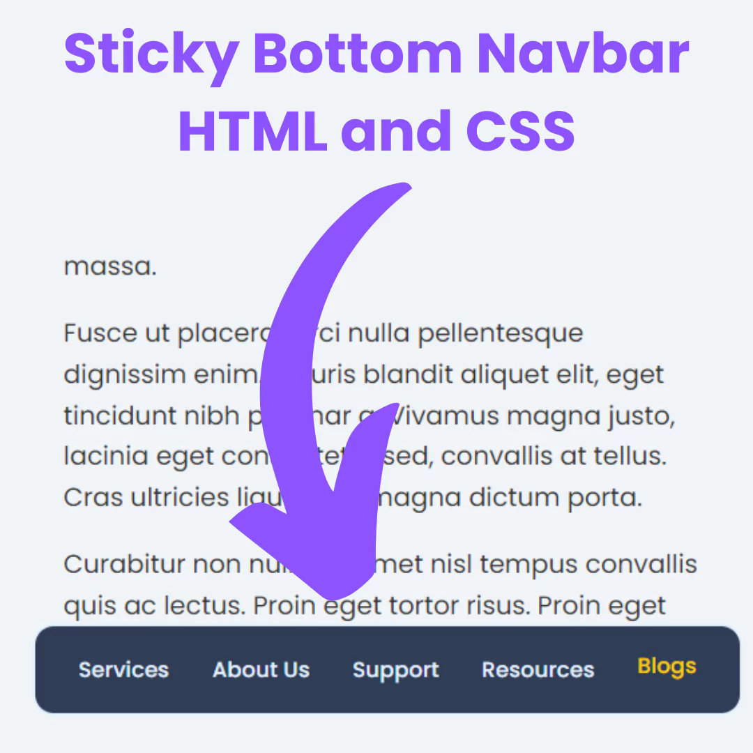
Learn HTML and CSS for a responsive website footer. Elevate user experience with our step-by-step guide on mobile-friendly footer design.

Table of Contents
Welcome to our detailed guide on creating a responsive footer using HTML and CSS. In today's digital landscape, where mobile devices play a pivotal role in web browsing, having a responsive footer is no longer a luxury—it's a necessity. A well-designed footer contributes to a seamless user experience, providing essential information and navigation options.
In this guide, we'll explore the key elements of a responsive footer, diving into the intricacies of HTML and CSS to help you craft a footer that not only adapts to various screen sizes but also elevates the overall aesthetics of your website. Whether you're a seasoned developer or just starting, this comprehensive tutorial will equip you with the knowledge and skills to create a footer that leaves a lasting impression.
Join us on this journey as we unravel the art of designing a responsive footer that not only meets technical standards but also enhances the user experience on your website. Let's get started!
Source Code
Step 1 (HTML Code):
To get started, we will first need to create a basic HTML file. In this file, we will include the main structure for our footer.
After creating the files just paste the following codes into your file. Make sure to save your HTML document with a .html extension, so that it can be properly viewed in a web browser.
Let's break down the provided HTML code step by step:
1. <!DOCTYPE html>: This declaration defines the document type and version of HTML being used, in this case, HTML5.
2. <html lang="en">: This is the root element of the HTML document. The lang attribute specifies the language of the document, which is set to English (en).
3. <head>: This section contains meta-information about the HTML document, such as character set, viewport settings, title, and external resources.
- <meta charset="UTF-8" />: Specifies the character encoding for the document as UTF-8, which is a widely used character encoding.
- <meta name="viewport" content="width=device-width, initial-scale=1.0" />: Sets the viewport properties for responsive design, ensuring that the width is equal to the device width, and the initial zoom level is set to 1.0.
- <title>Footer 3</title>: Sets the title of the HTML document to "Footer 3".
- <link rel="preconnect" href="https://fonts.googleapis.com" /> and <link rel="preconnect" href="https://fonts.gstatic.com" crossorigin />: These lines establish preconnect hints for faster loading of external resources from Google Fonts.
- <link href="https://fonts.googleapis.com/css2?family=Poppins:wght@400;500;600&display=swap" rel="stylesheet" />: Includes a stylesheet for the Google Fonts API, loading the "Poppins" font in weights 400, 500, and 600.
- <link rel="stylesheet" href="https://fonts.googleapis.com/css2?family=Material+Symbols+Outlined:opsz,wght,FILL,GRAD@24,400,0,0" />: Includes another stylesheet for Google Fonts, loading the "Material Symbols Outlined" font with specific parameters.
- <link rel="stylesheet" href="src/style.css" />: Links an external CSS stylesheet located in the "src" directory.
4. <body>: This is the main content of the HTML document.
- <footer>: Defines the footer section of the document.
- <article>: Represents an independent piece of content within the footer.
- <h2>Try Hologram today.</h2>: Displays a heading with the text "Try Hologram today."
- <button>: Defines a button.
- <p>Sign up free</p>: Represents a paragraph within the button with the text "Sign up free."
- <span class="material-symbols-outlined"> trending_flat </span>: Includes a span element with a class for styling, and displays the text "trending_flat" using a special material symbol.
- <section class="top">: Represents the top section of the footer.
- <img src="https://raw.githubusercontent.com/frontend-joe/css-footers/da46d1947acfcfb6f2ad9ee5c69d642f93920923/footer-3/logo.svg" />: Embeds an image with the specified source URL.
- <ul>: Defines an unordered list.
- List items (<li>) with headings (<h3>) and anchor (<a>) elements. This structure forms a navigation menu with links categorized under "Resources," "Pricing," "Developers," and "Company."
- <section class="bottom">© 2023 Hologram</section>: Represents the bottom section of the footer, displaying a copyright notice.
5. </footer>: Closes the footer section.
6. </body>: Closes the body section.
7. </html>: Closes the HTML document.
This is the basic structure of our footer using HTML, and now we can move on to styling it using CSS.
Step 2 (CSS Code):
Once the basic HTML structure of the footer is in place, the next step is to add styling to the footer using CSS.
Next, we will create our CSS file. In this file, we will use some basic CSS rules to create our footer.
Let's break down the code into paragraphs for better understanding:
1. Body Styling:
The styling for the overall body of the webpage is defined first. The background is set to a light color (#f8f9fb), and the font family is specified as "Euclid Circular A" with a fallback to "Poppins" in case the former is not available.
2. Universal Box Sizing:
The universal selector (*) is used to apply the box-sizing property to all elements, ensuring that the box model includes padding and border in the element's total width and height.
3. Footer Styling:
The footer section is styled to be fixed at the bottom of the page with a specific background color (#0a1535) and text color (#f9f9f9). Inside the footer, an article element is further styled with flexbox properties, a gradient background, and a border-radius, creating a visually appealing container.
The h2 and button elements within the footer article are also styled. The heading has a specific font weight and color, while the button is designed with flex properties, background color, and border-radius, making it consistent with the overall footer design.
4. Responsive Design:
Media queries are used to make the design responsive. For screens wider than 480 pixels, adjustments are made to the button width in the footer article and padding in the top section's unordered list.
For screens wider than 600 pixels, additional changes are applied. The flex direction of the footer article is altered, the minimum height is set, and adjustments are made to the button width and padding. The number of columns in the top section's unordered list is also modified.
5. Top Section Styling:
The top section of the page is further styled. It includes padding, margin, and styling for images, unordered lists, list items, and anchor links. The layout of the unordered list is defined using grid properties.
6. Bottom Section Styling:
The bottom section of the page is styled with padding, a top border, and specific color and font-size properties.
This will give our footer an upgraded presentation. Create a CSS file with the name of styles.css and paste the given codes into your CSS file. Remember that you must create a file with the .css extension.
body {
  background: #f8f9fb;
  font-family: "Euclid Circular A", "Poppins";
}

* {
  box-sizing: border-box;
}

footer {
  position: fixed;
  left: 0;
  bottom: 0;
  right: 0;
  padding-bottom: 20px;
  background: #0a1535;
  color: #f9f9f9;
}

footer article {
  display: flex;
  flex-direction: column;
  align-items: center;
  justify-content: space-between;
  gap: 16px;
  padding: 20px 50px 40px;
  margin: -99px 20px 20px;
  border-radius: 10px;
  background: linear-gradient(90deg, #773ecb, #2663ff);
}

footer article h2 {
  font-weight: 400;
  color: rgb(255 255 255 / 70%);
}

footer article button {
  display: flex;
  align-items: center;
  justify-content: space-between;
  gap: 10px;
  padding: 0 40px 0 44px;
  width: 100%;
  background: #0a1536;
  border: 0;
  border-radius: 30px;
  color: #f9f9f9;
  font-family: inherit;
  font-size: 16px;
}

footer section {
  padding: 0 50px;
}

section.top {
  padding-top: 30px;
  margin-bottom: 48px;
}

section.top img {
  display: block;
  height: 30px;
  margin: 0 0 30px;
}

section.top ul {
  list-style: none;
  padding: 0;
  margin: 0;
  display: grid;
  gap: 30px;
  grid-template-columns: repeat(2, 1fr);
}

@media (width > 480px) {
  footer article button {
    width: 70%;
  }

  section.top ul {
    padding-right: 10%;
  }
}

@media (width > 600px) {
  footer article {
    flex-direction: row;
    min-height: 140px;
    margin: -70px 20px 20px;
    padding: 30px 50px 30px;
  }

  footer article button {
    width: auto;
    padding: 0 20px 0 24px;
  }

  section.top ul {
    grid-template-columns: repeat(4, 1fr);
    padding-right: 0;
  }
}

section.top ul li a {
  display: block;
  margin-bottom: 10px;
  color: rgb(255 255 255 / 90%);
}

section.top h3 {
  color: rgb(255 255 255 / 40%);
  font-weight: 400;
  text-transform: uppercase;
  font-size: 12px;
  letter-spacing: 1px;
}

section.bottom {
  padding-top: 10px;
  border-top: 2px solid rgb(255 255 255 / 10%);
  color: rgb(255 255 255 / 40%);
  font-size: 13px;
}
Final Output:

Conclusion:
Congratulations! You've successfully navigated through our comprehensive guide on creating a responsive footer using HTML and CSS. By now, you should have a well-rounded understanding of the importance of a responsive footer and the steps involved in crafting one.
Thank you for joining us on this journey. We hope this guide has empowered you to create not just a responsive footer, but a dynamic and engaging one. Happy coding!
Code by: Joe
That’s a wrap!
I hope you enjoyed this post. Now, with these examples, you can create your own amazing page.
Did you like it? Let me know in the comments below 🔥 and you can support me by buying me a coffee
And don’t forget to sign up to our email newsletter so you can get useful content like this sent right to your inbox!
Thanks!
Faraz 😊


