Learn how to create a Sticky Call Button using HTML and CSS to enhance user experience and boost conversions. Follow our step-by-step guide today!

Table of Contents
In the fast-paced digital landscape, where instant access and seamless interactions are paramount, websites play a pivotal role in delivering information and services. As online visitors explore various websites, they often seek quick and efficient ways to engage with businesses, whether it's to ask questions, make inquiries, or initiate transactions. This is where a Sticky Call Button comes into play as a powerful tool that enhances user experience and bridges the gap between the virtual and the real.
Imagine a scenario: a potential customer is browsing through your website, intrigued by your offerings, and suddenly has a question that requires immediate clarification. Without a straightforward means of communication, that visitor might hesitate, get frustrated, or worse, navigate away in search of a more accessible alternative. This is precisely where a Sticky Call Button can turn the tide in your favor.
A Sticky Call Button is a persistent, ever-present call-to-action strategically placed on your website, beckoning visitors to take action with a single click. Designed to remain in view as users scroll through your content, it eliminates the need for visitors to hunt for contact information or jump through hoops to initiate communication. Whether it's a potential lead interested in your products or a customer requiring assistance, the Sticky Call Button serves as a direct line of connection, making the entire process smoother and more user-friendly.
In this comprehensive guide, we will delve into the world of web design and explore how to create a Sticky Call Button using the dynamic duo of HTML and CSS. We will uncover the art of seamlessly integrating this unobtrusive yet powerful tool into your website, thereby boosting conversions, fostering engagement, and elevating user satisfaction. So, whether you're a seasoned web developer or just embarking on your coding journey, get ready to unlock the potential of a Sticky Call Button and transform the way you connect with your online audience.
Without further ado, let's dive into the world of web design and unleash the potential of the Sticky Call Button!
Source Code
Step 1 (HTML Code):
To get started, we will first need to create a basic HTML file. In this file, we will include the main structure for our sticky button.
After creating the files just paste the following codes into your file. Make sure to save your HTML document with a .html extension, so that it can be properly viewed in a web browser.
Let's break down the code step by step:
1. <!DOCTYPE html>: This declaration specifies that the document is an HTML5 document.
2. <html lang="en">: The <html> tag is the root element of the HTML document. The lang attribute indicates that the language of the content is English.
3. <head>: The <head> section contains meta-information about the web page that is not displayed directly to the user.
- <title>Sticky Call Button</title>: This sets the title of the web page, which is typically displayed in the browser's title bar or tab.
- <meta charset="UTF-8" />: This specifies the character encoding of the document, which is set to UTF-8, a widely used character encoding that supports various languages and special characters.
- <meta name="viewport" content="width=device-width" />: This meta tag defines the viewport settings for responsive design, ensuring that the width of the viewport matches the width of the device's screen.
- <link rel="stylesheet" href="https://cdnjs.cloudflare.com/ajax/libs/font-awesome/5.10.0/css/all.min.css">: This line links to a CSS stylesheet hosted on a content delivery network (CDN) that provides the Font Awesome icon library. The stylesheet contains styles for various icons.
- <link rel="stylesheet" href="styles.css" />: This line links to an external stylesheet named "styles.css" located in the same directory as the HTML file. This stylesheet likely contains additional custom styles for the web page.
4. <body>: The <body> section contains the visible content of the web page.
5. <a class="fixed-tel" href="tel:+8548222xxx" target="_blank" title="Call Now"><i class="fas fa-phone-alt"></i></a>: This line creates an anchor (link) element. Here's what each attribute means:
- class="fixed-tel": Assigns the CSS class "fixed-tel" to the anchor element. This class could be used to apply specific styles to this element.
- href="tel:+8548222xxx": Specifies the telephone number that the link is associated with. Clicking on this link will initiate a phone call to the provided number.
- target="_blank": Instructs the browser to open the link in a new tab or window.
- title="Call Now": Sets the tooltip text that appears when the user hovers over the link.
- <i class="fas fa-phone-alt"></i>: This is an icon element that utilizes the Font Awesome library. It displays a phone icon using the "fas fa-phone-alt" class.
This is the basic structure of our sticky call button using HTML, and now we can move on to styling it using CSS.
Step 2 (CSS Code):
Once the basic HTML structure of the sticky button is in place, the next step is to add styling to the sticky button using CSS.
Next, we will create our CSS file. In this file, we will use some basic CSS rules to create our sticky button.
Let's break down the code step by step:
1. .fixed-tel: This is a class selector that will be applied to an HTML element (likely a <div> or a <span>) to style it according to the defined properties.
- position: fixed;: This property makes the element's position fixed relative to the viewport. It means that the element will stay in the same position even when the user scrolls.
- bottom: 20px; right: 20px;: These properties set the distance of the element from the bottom and right edges of the viewport, creating a 20px margin.
- width: 50px; height: 50px;: The width and height of the element are both set to 50px, creating a square button.
- line-height: 50px;: This property aligns the content vertically within the button by setting the line height to match the button's height.
- z-index: 9999;: This sets the stacking order of the element. A higher value will place the element above other elements with lower z-index values.
- text-align: center;: This centers the content horizontally within the button.
2. .fixed-tel:before: This is a pseudo-element that is used to create a circular background behind the main icon.
- content: "";: This property is required for pseudo-elements and represents the content of the element. In this case, it's empty.
- width: 50px; height: 50px;: These properties define the width and height of the circular background.
- background-color: #ff5f13;: This sets the background color of the circular background.
- position: absolute;: This positions the circular background absolutely within the parent element.
- border-radius: 100%;: This creates a circular shape by setting a border radius of 100%.
- box-shadow: ...;: This property adds a subtle shadow to the circular background for a visual effect.
- z-index: 1;: The stacking order of the circular background.
- top: 0; left: 0;: Positions the circular background at the top-left corner of the parent element.
3. .fixed-tel i: This targets an <i> element within the .fixed-tel element. It's likely that the telephone icon is represented using an <i> element with an appropriate icon font or an SVG.
- vertical-align: middle;: This property aligns the icon vertically within its line.
- z-index: 2;: The stacking order of the icon.
- position: relative;: The icon is set to be positioned relative to its normal position.
- color: #030f27;: The color of the icon.
- font-size: 1.5rem;: The size of the icon.
This will give our sticky call button an upgraded presentation. Create a CSS file with the name of styles.css and paste the given codes into your CSS file. Remember that you must create a file with the .css extension.
.fixed-tel {
  position: fixed;
  bottom: 20px;
  right: 20px;
  width: 50px;
  height: 50px;
  line-height: 50px;
  z-index: 9999;
  text-align: center;
}

.fixed-tel:before {
  content: "";
  width: 50px;
  height: 50px;
  background-color: #ff5f13;
  position: absolute;
  border-radius: 100%;
  box-shadow: 0 1px 1.5px 0 rgba(0, 0, 0, .12), 0 1px 1px 0 rgba(0, 0, 0, .24);
  z-index: 1;
  top: 0;
  left: 0;
}

.fixed-tel i {
  vertical-align: middle;
  z-index: 2;
  position: relative;
  color: #030f27;
  font-size: 1.5rem;
}
Final Output:

See the Pen Sticky Call Button by Faraz (@codewithfaraz) on CodePen.
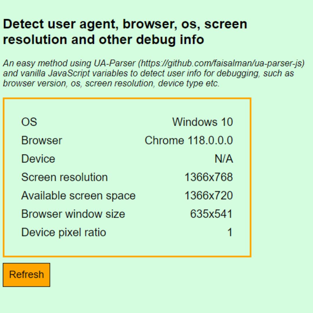
 Detect User's Browser, Screen Resolution, OS, and More with JavaScript using UAParser.js Library
Conclusion:
In the dynamic realm of web design, where user experience reigns supreme, the Sticky Call Button emerges as a game-changing element that can redefine how users engage with your website. As we draw the curtains on this guide, let's recap the journey we've undertaken and the impact this small but significant feature can have on your online presence.
Throughout this tutorial, we've explored the multifaceted benefits of integrating a Sticky Call Button into your website. From offering immediate access to contact channels to enhancing user navigation and simplifying communication, this unassuming button carries the potential to bridge the gap between your virtual platform and real-world interactions.
By following the step-by-step instructions, you've learned how to craft a Sticky Call Button using HTML and CSS. From setting up the underlying structure to infusing it with eye-catching design and ensuring it remains conveniently positioned, you're now equipped to implement this feature seamlessly into your website.
Remember, the Sticky Call Button isn't just a design element; it's a gateway to meaningful engagement. It empowers your visitors to take action without hesitation, fostering trust and cultivating a positive relationship with your brand.
So go ahead, implement what you've learned and watch as your website transforms into a more user-centric, accessible, and conversion-friendly platform. As you make this feature a part of your design arsenal, you're not just adding a button; you're adding a direct line of communication, a pathway to conversion, and an avenue for building valuable connections.
Thank you for embarking on this journey with us. Here's to creating websites that prioritize user needs, enhance accessibility, and ultimately contribute to your online success. So, raise that digital toast to the power of the Sticky Call Button, and may your web design endeavors be as seamless as the interactions it enables. Cheers to a future full of engaged users and thriving websites!
That’s a wrap!
I hope you enjoyed this post. Now, with these examples, you can create your own amazing page.
Did you like it? Let me know in the comments below 🔥 and you can support me by buying me a coffee
And don’t forget to sign up to our email newsletter so you can get useful content like this sent right to your inbox!
Thanks!
Faraz 😊


